Gartner Report

Purpose of the Exams

Let's Begin
Learn more on the Tableau Desktop Specialist Certification to excel in essential Tableau skills. Challenge your skills with the more complex Tableau Desktop Certified Associate Certification to demonstrate your proficiency in Tableau. All the questions have been refreshed to reflect the latest variety and content as of . Our exams consists of questions ranging from Connecting Data, Analyzing Data, developing Insightful Dashboards, creating Calculations, analyzing critical Tableau Concepts, the latest Job Interview Questions, and more. The sample exam below will give you an overview of what we have in our repository, waiting to be explored. Score 70% from 10 questions in 20 minutes to pass the below exam. The Datasets for the Exam are downloadable from the Menu above. To retrieve a new set of questions from our database, hit the 'Refresh' button and wait a few seconds while you are presented with a completely new set of questions.Buy Practice Exam
We are excited to present you with unlimited opportunity to learn and practice Tableau, for free. But there is a limit to how many times the free tests can be attempted. So we are glad to share with you flexible plans to access more of our immersive contents. Every attempt below brings to you 10 questions at extremely affordable prices. The questions simulate real certification questions with topics ranging from Dashboards, Level of Detail Calculations, Order of Operations, Blending, Joining, Groups, Sets, Chart Types, and more.✍ Explore the latest concepts and trends in the industry and professional world with the included Tableau Interview Questions in every attempt. Immerse in actual real-life problems and practice hands-on to enhance your analytical skills on key topics.
✍ Improve your aptitude with Unique Set of Questions in every attempt. Challenge your skills with problems chosen randomly from a vast pool of 1000+ Logical and Practical problems using our Vision algorithm.
✍ Expect these problems in any of the Tableau Certification Exams and Analytical Interviews you are preparing for in . Learn and accelerate your career with the freshest insightful questions built on the latest Tableau versions.
Tableau Desktop Specialist Certification
✍ The Tableau Desktop Specialist Certification costs $100 and there is no eligibility criterion to take the exam. This exam evaluates your essential skills of using the Tableau Desktop and your readiness to use all the analytical functionalities of the tool. Based on discussions with our experts, our recommended hands-on Tableau experience before you attempt this test is 12-16 weeks.✍ You can predict your performance by checking your results in our Tableau Desktop Specialist Practice Exam. You have to score 70% from 30 multiple-choice questions in 60 minutes to get the certificate. It consists of both theoritical and practical questions. The Tableau Desktop Specialist Certificate does not expire. To schedule the exam with Tableau, choose 'Schedule Exam' from the References Menu above.
Tableau Desktop Certified Associate Certification
✍ The Tableau Desktop Certified Associate Certification costs $250 and there is no eligibility criterion. This exam assesses deeper knowledge of using Tableau Desktop using logical analysis with questions having Level of Detail Expressions, Order of Operations, and more. Our recommended hands-on Tableau experience by our experts before you attempt this test is 20-24 weeks.✍ To predict your performance in the actual test take our Tableau Desktop Certified Associate Practice Exam. You have to score 75% from 36 multiple-choice questions in 120 minutes to get the certificate. The Tableau Certified Associate Certification has a validity period of 2 years. Tableau offers 40% discount on renewal of the Certificate, so you will pay $150 instead of $250 for the Tableau Certified Associate Certification when you renew. To schedule the exam with Tableau, choose 'Schedule Exam' from the References Menu above.
Introduction to Data Visualization
The world has been changing rapidly; markets are changing, buying power is changing, living style is changing. With each purchase, transaction or decision made by people, there is a huge amount of data that is being generated. Imagine how vast the data cloud is and how long it would take us to barely scratch the surface.
Well, that would have been the case of past.
But all the data in the world is useless – in fact, it can be a liability – if you cannot understand it.
Thanks to visualization, data is no longer an unwanted friend or a scary stranger. In fact, it has now become a guiding light for us. Data visualization is about how you present your data, to the right people, at the right time, to enable them to gain insights most effectively.
There are numerous visualization tools out there to help us analyze the data and make informed decisions to suit our purposes and requirements.
Well, let us get started with a quick review of some of the best, most innovative and most popular data visualization tools available in the market. These are all paid tools (of course they offer free trials, student licenses or personal-use licenses).
Excel:
This one probably does not require an introduction. From school goers to CEOs, everyone would have used excel at least once. This is part of Microsoft Office suite which makes it readily available to users. Though we cannot call Excel a data visualization tool, we can build some graphs from the spreadsheet to better ‘view’ the data.
According to Jon Peltie, Excel developer and consultant “Excel isn't explicitly a data visualization tool, it's a spreadsheet, however one of its strength is its flexibility and additional features which help building our data in an understandable format”
Before we go all gaga about the newcomers, we should give excel the respect it deserves. You can build simple visualizations, also known as charts, with excel. There are various charts available like line, bar, area, pie, combination charts. You can see the different chart types by going to ‘Insert’ tab in excel and you can see charts in the fourth place in the insert bar.
You can refer to the screenshot below.

So, why not use excel if it’s easy to use and readily available and requires minimal or no training to create visualizations?
Well, here is the reason.
Let us say you have data regarding sales of different products across different regions or countries. You can represent this data in excel as bar chart showing the countries with length of bars representing the sales volume for that country. While it is just OK to look at, imagine, you can actually plot this out on a map. Showing the countries in different colors based on user requirements gives a quick understanding of the underlying data.
Like they say, pictures speak more than words do. Does this mean excel is not good at all? No, that is not true, a real business analyst makes use of both excel and any other advanced visualization tool to properly work with the data.
Next one in the line is QlikView.
QlikView:
QlikView is used for developing highly interactive guided analytics applications and dashboards, which deliver insights to solve business challenges. It has revolutionized the way organizations use data with intuitive visual discovery. QlikView put Business Intelligence (BI) capabilities into the hands of more people than ever before.
QlikView is a BI data discovery product for creating analytics applications and dashboards tailor-made for various business challenges.
QlikView enables users to create data insights and relationships across various sources with its Associative Data Indexing Engine. It also offers guided exploration, discovery, and collaborative analytics solutions for sharing insights.
Also, it allows users to build and deploy analytic apps without requiring professional development skills. It also helps in providing faster response to changing business requirements, shorter time to value and more insight across an organization.
The tool can consolidate data from multiple sources to provide a centralized data view for high level reporting.
Moving on to the next one- Microsoft Power BI
Power BI:
Power BI took our analysis and reporting to new heights. It transforms large data masses to valuable insights which can help businesses make better strategic and informed decisions. It has never been this easier, faster, or more agile to collect and visualize data, which aids in creating beautiful, easy-to-understand reports.
Unlike traditional desktop tools, Power BI Service is used through your web browser, which means you can access the reports from anywhere, anytime. With Power BI you are always one step ahead, because all the information you need is always only a few clicks away.
To put it in simple words, Power BI is for business owners or managers who need not have much analytics knowledge. Tableau is more powerful and mostly useful for data scientists or data analytics individuals. Tableau is thus a little bit difficult to learn when compared to Power BI. So, it is right to say that Power BI wins when it comes to ease however Tableau wins if we compare speed and capabilities.
Well, it is time to move onto our tool in today’s discussion- Tableau
Tableau:
Given the present-day data needs, Tableau is a powerful and one of the fastest growing data visualization tools used in the Business Intelligence Industry. It simplifies raw data into a very easily understandable format.
Data analysis is quick with Tableau and the visualizations created are in the form of stories, dashboards, and worksheets. The visualization that is created using Tableau can be understood by professionals at any level in an organization, technical or not. Due to this, even a non-technical user with some understanding of tableau can create a customized dashboard.
The best features of Tableau are
- Data Blending
- Real time analysis
- Collaboration of data
The best thing about Tableau software is that it does not require any kind of technical or programming skills to operate. The tool did garner interest among the people from different sectors such as academics, business, research, different industries, etc.
Tableau Server, Tableau Desktop, Tableau Public, Tableau Reader, Tableau Prep are Tableau’s various other products. Tableau public is a free version which does not let you connect to as many data sources as licensed version. However, major functionalities work fine in Public version.
With regular version releases, tableau is up to date with newer and cooler features getting added.
Now, since we have a basic understanding of these tools, let us get started with Tableau.
While learning tableau might seem like an uphill task, we can break it down to simpler milestones.
- Installation:
14-day trial version of Tableau can be downloaded from Tableau Desktop. You need to register with your details to be able to download. Once you download, the installation is a very straightforward process in which you need to accept the license agreement and provide the target folder for installation.
The following steps and screenshots describe the entire setup process. Start the Installation Wizard Double-click the TableauDesktop-64bit-9-2-2.exe. You will see a screen asking for confirmation for the installation program to run. Click “Run”.

Next, you will see another pop up requesting you to read the License Agreement. Click on View License Agreement and if you agree, click on the check box “I have read and accept the terms of this License Agreement.”

After this, the Install button gets activated. Click on it. Once the installation is completed, you will be prompted to choose one from start trial now, start trial later and activate. If you have a product key, click on Activate and enter the key. If you wish to continue with the trial, click on the same.

Now that we have the tool in place, let us get started with the next step.
- Data:
Tableau can connect to a huge range of data sources, like excel, sql, oracle google sheets. You can connect to the data source where your data is stored. Tableau has a default workbook Superstore to easily understand various visualizations. First time users can just double click on Superstore sample workbook and look at how each dashboard is built.

- Worksheet:
After connecting to the data source, a new ‘sheet 1’ tab will be created. You can preview your data in the data source page. Click on the Sheet 1 tab and a worksheet opens where you can start working on building your charts.

Depending on what field(s) you want to include in your view, tableau shows suggestions when you drag and drop the fields to the workspace. This can be achieved by clicking on ‘Show me’.

- Dashboard
Once you have your required worksheets, you can now move on to creating a dashboard. On the dashboard workspace, you can drag and drop as many worksheets as you want to include in the view. You can add different dashboard actions (filters, highlighters, URLs etc).
Lollipop charts
Lollipop charts are essentially a bar chart with a dot on the end. We use lollipop charts to compare the size or the magnitude of things by encoding the length from 0 to a value on an axis. These charts put more emphasis on the data value than a standard bar chart.
Pros and Cons:-
Starting with pros, lollipop charts are easy to comprehend and they're easy to build in just a few clicks. They do a good job to allow for comparisons of categorical data. And now the cons. The point at the end of the lollipop chart can cause some trouble. First of all, the dot overstates the value. When we draw a mark using a circle or another shape, Tableau draws that point at the center of the shape. So the shape that we use for the end of our bar usually extends past the point it's visualizing. This can cause trouble when trying to make fine or absolute comparisons, and this problem gets worse when the dot is sized too large.
Demo:-
Now let's learn how to build a lollipop chart. (For building all the charts in this article you need to connect to Superstore data source.) We are going to create a lollipop chart. A lollipop chart is basically a bar chart with a dot at the end. For this, first, drag Category and Sub-Category to rows shelf and drag Sum of Sales on columns shelf. Now, make a copy of Sales on Columns and drag it back onto Columns. Now make it Dual Axis. Right click on the first axis and select Synchronize Axis. Right-click again and select Show Header to hide it. Now, on the middle marks card, change the mark type to Bar. Now just dial down the size to a very thin bar. And that's the lollipop chart.

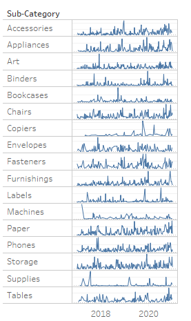
Sparklines
Sparklines are very small line charts, commonly drawn without axes or coordinates. They can be small enough that they are embedded within a line of text. They present the general shape of variation over time in a simple and highly condensed way. Sparklines are often meant to highlight variation by using truncated axes.
Pros and Cons:-
Starting with the pros, Sparklines are meant to be extremely space efficient. They can even be as small as one line of text and could be placed in line within analysis. They are meant to be used where the conversation is happening around the data. They do a good job of showing the general shape of data and highlight variation over time, and they scale very well and can compact a lot of data into a small space. And now the cons. Because the lines are so small, it is hard to extract any real detail. Their intended purpose is more so to inform at a glance, and this is along the same lines, but generally there are no axes displayed, and there may be truncated axes to highlight variation.
Demo:-
Now, let's jump into Tableau and learn how to build sparklines. Let's drag Sub-Category and sum of Sales on to rows shelf, and let's drag Order Date on to the Columns shelf. Now change the Year of Order date to Week number from drop down. Now, notice here we have 17 line charts in different rows for each category. The data is pretty flat across the board with the exception of a few spikes in copiers and machines that, of course, we would suspect since they would have higher sales than something like paper. Let's update the title since we changed to sub-category. As discussed, the point of the sparkline is to show the shape of the data, or to highlight variation. In most cases, these charts will use a truncated axis to highlight that variation between data points. Let's right-click on one of the tiny y axes and select Edit Axis. Under the Range options, change from Automatic to Independent axis ranges for each row or column. Now, right-click on the y axis again and select Show Header to hide them. Now to show how sparklines can be condensed into a small space, set our view to Fit Height. Now slide the right side of the chart to the left, condensing the spread of the points. And here's our sparkline, and it's packing almost 2700 data points in this tiny space.
Step and Jump Lines
Both of these are based on line charts. The main difference from a basic line chart is that line charts portray a consistent rate of change between data points by connecting them with a straight line. However, that is not always the case. So enter step and jump lines, which use a modified path. Step lines draw an elbow to connect points, emphasizing the magnitude of change, while jump lines actually break the line, which emphasizes the duration of change. Both of these use path modification to highlight significant change between data points.
Pros and Cons:-
Starting with the pros. Both of these charts are essentially line charts, so the same pros apply. The main difference is how modifying the path between connected points can better handle an inconsistent rate of change in our data. Emphasize magnitude with step lines, and emphasize duration with jump lines. And now the cons. These should not be used to connect categorical data, and you need to take into account your audience data literacy. These are not standard chart types, and not everybody knows how to read them.
Demo:-
Now let's jump into Tableau and learn how to build step and jump lines. Let’s jump right into building a step line first. Let's drag Order Date to the Filters shelf. Select the discrete Month/Year variation of the date. Let's just filter to December 2018. We want to focus on just a little bit of data for this chart. Drag Category to Columns, and Ctrl+drag Order Date to Columns. Select the Day date value. Also, let's drop Sales on Rows. Let's make a copy of Category from the Columns shelf and drop it on Color on the marks card. Okay, so we have a normal line chart here. Now, Click on Path, change the line type from linear to step. Now, let's make a copy of Sales on the Rows shelf and drop it back on Rows. Expand the Top Sales marks card and drag Category off of the marks card. Let's click on Path and change our line type to the second option of step line. Now right-click on the second pill on the Rows shelf and select Dual Axis. Here we have the combination step jump line.

Donut Chart
Donut charts are used to show a part-to-whole relationship. They are essentially a pie chart with the hole cut out of the middle and represent the shape of a donut. The hole makes space for more information about the data, like totals, and helps us better communicate the part-to-whole relationship versus a pie chart.
Pros and Cons:-
Starting with the pros. A donut is the same thing as a pie chart, so our users should be used to seeing these charts. These charts show a part-to-whole relationship very accurately when used effectively. And now the cons. These charts are not much preferred because this is a part-to-whole chart, it needs to add up to 100%. There should not be too many slices. Recommendation is that you do not go over four slices max. The slice needs to be sorted by size. Colors and labels should be used effectively. Don't make them 3D, that's even worse. However, in Tableau, there are some tricks used to make donut charts that can help unlock the use of the dual axis creativity for the future.
Demo:-
We need to create a view that takes the total sales and breaks it down into segments. First, let's change the view to Entire View and change the mark type to Pie. Let's drag Segment onto Color on the marks card. Notice, Tableau has drawn a pie chart, but right now the slices are of equal sizes. Drag Sales onto Angle and see the change. Here we have our pie chart.
To create the cutout for our donut, we need access to another marks card. Double-click in the Columns shelf and type min, and put 1 in parentheses. Notice, Tableau moved our pie onto an axis at the number 1. Make a copy of the pill on Columns and drop it back on Columns. Now we have two pie charts side by side and access to an additional marks card. Expand the bottom marks card. Right-click in the whitespace and select Clear Shelf. This is going to be our hole for the donut. Click on the top marks card. Dial size up to the second hash mark. Go back to the bottom marks card, dial size up to be between the hash marks. Right-click on one of the axes and select Dual Axis. Now right-click on that axis again and select Synchronize Axis. Notice, this put our gray circle on top of our pie chart. Now click on the bottom marks card, click on Color, and change the color to be white to match our background. And Here we have our Donut Chart.

Let's visit the various important and interesting features of Tableau. The bundle of unique features that make Tableau a well-liked and widely accepted Business Intelligence tool and powerful visualization tool. Tableau is considered as collectively of the most effective Business Intelligence and data visualization tools and has managed to top the charts quite few times since its launch.
The foremost important quality of this tool is that it makes organizing, managing, visualizing, and understanding data straightforward for its users. Data is additionally as complex and mysterious as we'll imagine and requires proper tools to extract meaning from it. Such tools enable us to dig deep into the knowledge so as that we can discover patterns and acquire meaningful insights.
Tableau provides us with a bunch of tools that equip us to undertake, and do data discovery, data visualization and insight sharing at a close level. One interesting aspects of Tableau is simple drag-and-drop functionality other than other BI tools. You're doing not must come from a technical background or know many coding to be able to work on Tableau.
Given below are the most effective features of Tableau
- Tableau Dashboard
- Collaboration and Sharing
- Live and In-memory Data
- Data Sources in Tableau
- Advanced Visualizations (Chart Types)
- Maps
- Robust Security
- Mobile View
- Ask Data
- Trend Lines and Predictive Analysis
Tableau Dashboard
Tableau Dashboards provides an overall view of your data regarding visualizations, visual objects, text, etc. Dashboards are very informative as they're visiting present data within the sort of stories, enable the addition of multiple views and objects, provide an expansion of layouts and formats, enable the users to deploy suitable filters. You even have the selection to repeat a dashboard or its specific elements from one workbook to a special easily.
Collaboration and Sharing
Tableau provides convenient options to collaborate with other users, and instantly share data within the range of visualizations, sheets, dashboards, etc. in real-time. It allows you to securely share data from various data sources like on-premise, on-cloud, hybrid, etc. Instant and simple collaboration and data sharing help in getting quick reviews or feedback on the knowledge leading to how better overall analysis of it.
Live and In-memory Data
Tableau supports the connectivity to both live data sources and data extraction from external data sources as in-memory data. This provides the user the pliability to use data from over one quite data source with no restrictions. You'll use data directly from the knowledge source by establishing live data connections or keep that data in-memory by extracting data from an information source as per their requirement. Tableau provides some more additional features to support data connectivity like automatic extract refreshes, notifying the user upon a live connection fail, etc.
Data Sources in Tableau
Tableau offers a myriad of information source options you will be ready to attach with and fetch data from. There are various Data source connections ranging from on-premise files, spreadsheets, relational databases, non-relational databases, data warehouses, big data, to on-cloud data are all available on Tableau. One can easily establish a secure connection to any of the knowledge sources from Tableau and use that data along with data from other sources to form a combinatorial view of knowledge within the range of visualizations. Tableau also supports differing types of knowledge connectors like Presto, MySQL, Google Analytics, Google Sheets, Cloud era, Hadoop, Amazon Athena, Salesforce, SQL Server, Dropbox and much of more.
Advanced Visualizations (Chart Types)
One in all the key features of Tableau then the one that got its popularity is its wide selection of visualizations.
In Tableau, you will be able to make visualizations as basic as a:
- bar graph
- chart
and as advanced as a:
- Histogram
- Gantt chart
- Bullet chart
- Motion chart
- Tree map
- Box plot and plenty of more.
You can select and make any reasonably visualization easily by selecting the visualization type from the Show Me tab.
Maps
Yet another important feature of Tableau is the map. Tableau incorporates many preinstalled information on maps like cities, postal codes, administrative boundaries, etc. This feature of Tableau make the maps very detailed and informative. You will be ready to add different layers of geology on the map as per your requirements and build informative maps in Tableau together with your data. various varieties of maps available in Tableau are Heat maps, Flow map, Choropleth maps, Point distribution map, etc.

Robust Security
Tableau takes special care of information and user security. It is a fool-proof security system supported authentication, and permission systems for data connections and user access. Tableau also gives you the freedom to integrate with other security protocols like Active Directory, Kerberos, etc. an enormous point to note here is that Tableau practices row-level filtering which helps to stay the information secure.
Mobile View
Tableau takes the advantage of importance in mobile phones then it provides a mobile version of the Tableau app. One can create their dashboards and reports in such a fashion that it is also compatible with mobile. Tableau has the selection of constructing customized mobile layouts for your dashboard specific to your mobile device. The customization option gives the selection for adding new phone layouts, interactive offline previews, etc. Hence, the mobile view gives Tableau users a good deal of flexibility and convenience in handling their data on the go.
Ask Data
The Ask data feature of Tableau takes reporting to a next level and liked by users globally. This feature makes wiggling with data just a matter of straightforward searches as we do on Google. You merely must people query about your data in tongue and Tableau will present you with the foremost relevant answers. The answers don't seem to be only within the variability of text , but also as visuals. As an example, if what you searched for is already present during a chart, the Ask data option will search and open the chart for you instantly. Such features make data more accessible to users.
Trend Lines and Predictive Analysis
Another extremely useful feature of Tableau is that employment of ages series and forecasting. Easy creation of trend lines and forecasting is possible thanks to Tableau’s powerful backend and dynamic face. You'll easily get data predictions style of a forecast or a line by simply selecting some options and drag-and-drop operations using your concerned fields.

Miscellaneous Features of Tableau
Miscellaneous Features of Tableau together with the list of key features that we just covered. Tableau is loaded with plenty of other important additionally as useful features listed below:
- Cross database join
- Nested sorting
- Drag-and-drop integration
- Data connectors
- Prep conductor
- Text editor
- Revision history
- Licensing views
- ETL refresh
- Web Data connector
- External service integration
- Split function
Features of Latest Tableau Version: Tableau 2020.3
Tableau 2020.3 Tableau 2020.3 has recently been released with several exciting new features. Two other features, that wanted to specialize, in are useful to anyone who builds Tableau dashboards daily. They may not be the foremost powerful features within the new release, but they're ones which will make dash boarding a smoother, more user-friendly experience.
Filter and Search
A feature that has always are available handy on Tableau worksheets is the search bar within the Data pane, above your dimensions and measures. This permits you to go looking for the relevant fields you're looking to edit or bring into the view. However, if your anything like me, you'll often end ups forgetting what the names of your fields are, which might be very true for calculated fields you've got created yourself or in datasets where an oversized number of dimensions and measures are being employed.
Without knowing the name of the sphere and if you haven’t grouped your calculated fields together you might need to scroll all the way down to explore for the =# sign signifying the name of the field. With the new filter search feature, you'll separate out measures, dimensions, calculated fields and comments. Then isolate even further to only include those fields with the word sales: Although this feature might only be saving you some seconds at a time, this will really add up if building out views in Tableau is a few things you're doing regularly.
Also, if you're inheriting a workbook from some other person which is some things that often happens, having the ability isolate fields more easily can facilitate your get to grips with what work has already been done, in order that handover is often a more user-friendly experience.
Clear Parameter Values
Parameter actions came in Tableau 2019.2 and offers users the choice to drive the parameter value from clicking on a mark within the view. The worth remains the identical until you decide on a replacement mark. You'll set the default value for a parameter for when the workbook opens, but sometimes you wish to reset it to a value while you're within the workbook. Employing a parameter action, we will change the position of that reference line by clicking on the chart. There are ways to try to this in previous versions, but they involved creating a custom reset button:
However, now after you are fitting your parameter action, you have got a piece on the side that helps you to specify what is going to happen when clearing the choice. Keeping this value means the action will add the identical way because it always had, but setting the worth to a particular amount implies that are going to be the default value after you do the chart.
I personally think this feature could be a very powerful addition. It allows you to reset to a default view without reloading the full workbook on every occasion. This is often especially helpful once you are working in an exceedingly dashboard with multiple filters, parameters or sets applied on a dashboard in an exceedingly Server or Online environment, as you'll be able to reset your selected parameter without refreshing the dashboard and clearing those other actions.
Tableau Features: Quick view
Given below is a quick overview of Tableau features:
- API
- Access Control
- Active Directory Integration
- Activity Dashboard
- Ad hoc Analysis
- Ad hoc Query
- Ad hoc Reporting
- Categorization
- Collaboration Tools
- Content Library
- Custom Fields
- Customizable Reporting
- Dashboard Creation
- Data filtering, import/export, mapping, storage management, visualization.
- Database Integration
- Drag & Drop Interface
- Email Integration
- Email Notifications
- Filtered Views
- Gantt Charts
- Geographic Maps
- Geolocation
- Interactive Content
- Metadata Management
- Multiple Projects
- Offline Access
- Permission Management, Role-Based Permissions
- Real-Time Analytics, Real-Time Data
- Self Service Portal
- Task Management
- Third-Party Integration
- Trend Analysis
- Usage Tracking
Summary
During this article bought enough information on Tableau and its wide range of features. Tableau can be an awfully useful gizmo loaded with user-friendly features and functionalities which helps us extract valuable information from data.
